Colour Palettes
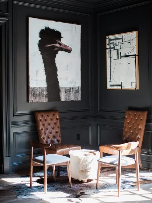
Colour palettes play a crucial role in web design, shaping how users emotionally connect with a brand and navigate a website. The right combination of colours can enhance readability, guide user behaviour, and create a strong visual identity that aligns with your brand values. Whether you're aiming for bold and modern or soft and minimal, a well-crafted website colour palette helps establish consistency across all touchpoints. We create custom colour schemes that are not only visually striking but also optimized for accessibility and user experience.

FONT PAIRINGS

EXPLORE
CONTRAST
Fonts should be different enough to create visual hierarchy, but still feel like they belong together. This can be achieved using different font styles, or by adjusting font weights.
HEIRARCHY
Clear font hierarchy helps users understand what’s most important at a glance. This involves using one font for headlines and another for body text and/or adjusting the size of text to draw reader’s attention to the most important information first.
STYLE & BRAND TONE
Fonts communicate tone — modern, traditional, playful, serious. It is important to ensure that font choices reflect a brand’s voice. A luxury brand might use elegant serifs; a tech brand might lean toward clean sans-serifs.


STRATGEY & PLANNING
RESOURCES

Ready to Build a Brand That Feels Like You ?
Your story’s one of a kind—your brand and website should be too. Let’s create something that captures your identity, connects with your audience, and looks damn good doing it.
Let’s make it real. Let’s make it you.


